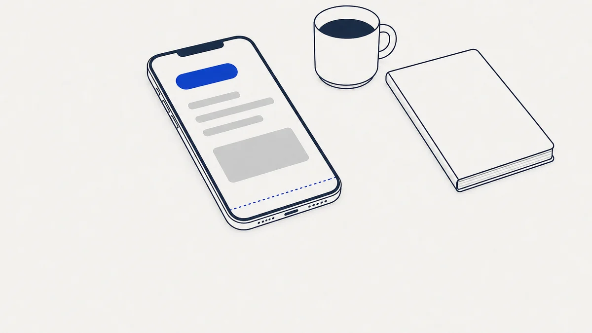
On a phone, your clinic website has one screen to say what you do and how to book. I ran a clinic website mobile check on 30 Australian homepages to see what fits in that screen. Only 6 showed a clear headline, a phone number and a booking button before any scrolling.
Want a second pair of eyes on your homepage? Book a free 30-minute call and we'll open it on a phone together. You'll get a fixed quote within 48 hours.
What does a clinic website show on a phone before you scroll?
A lot of thought goes into a clinic homepage. You can see it in the photos, the colours and the friendly words. But on a phone, much of that work sits below the first screen.
I loaded each homepage at the size of an everyday iPhone and saved the first screen. Then I looked at every one and noted what a patient could see without scrolling.
Headlines were the strongest result, and that's the hardest line to get right. Most sites told you plainly what they do. Booking buttons came next, on 19 of the 30.
The gap was in putting the pieces together. Only 6 sites showed all 3 basics at once, so most sites were missing at least one. Another 6 showed no phone number and no booking button. You had to scroll to find a way in.
How did each kind of clinic look on a phone?
Each kind of clinic had its own strength. I split the 30 sites into 4 groups, and the table shows how each group did.
| Kind of clinic | Clear headline | Phone number | Booking button | All 3 |
|---|---|---|---|---|
| Telehealth and weight loss (8 sites) | 8 | 1 | 6 | 1 |
| Cosmetic and skin (6 sites) | 4 | 2 | 5 | 1 |
| Dental (6 sites) | 5 | 5 | 3 | 3 |
| Allied health (10 sites) | 4 | 5 | 5 | 1 |
The online telehealth services had the clearest headlines. Every one of them said what it does in its first line. They rarely showed a phone number, which makes sense for a service you use online. Most leaned on a booking button instead.
Dental sites were the easiest to call, with a number on nearly all of them. Yet half of them had no booking button in the first screen. So a patient who would rather book than ring had to go looking.
Allied health had the most room to grow. I checked 10 physio, podiatry, dietetics and other allied sites. On 6 of them, the opening line didn't say what the clinic does. The lines were slogans, welcomes, a quote or an award.
Many of those lines were lovely, though. They just asked a new patient to guess. A slogan can feel like the heart of a brand. A patient on a phone, though, mostly wants to know they're in the right place.
Does your headline say what you do? Book a free 30-minute call and we'll read your first screen together. You'll get a fixed quote within 48 hours.
Why does the first screen on a phone matter so much?
Google reads your site the way a phone sees it. Its mobile-first indexing guide says, "Google uses the mobile version of a site's content, crawled with the smartphone agent, for indexing and ranking."
That means the phone version of your page is the one that counts for search. If your phone page shows less than your desktop page, Google may see less of you too.
There's a human side as well. A patient who searches on a phone often wants to act soon. They want to know they're in the right place, and then they want to call or book.
So the first screen has 2 jobs. It tells the patient they've found the right clinic, and it gives them a way to reach you.
Do pop-ups and chat bubbles get in the way?
Pop-ups were rarer than I expected, which was good to see. Only 4 of the 30 sites covered part of the page as it loaded.
Half of those were cookie banners. The other half were email newsletter pop-ups. They asked for your email address before you'd read a word about the clinic.
Google's guide to intrusive interstitials explains why that matters. It says "interrupting users with intrusive interstitials may frustrate them and erode their trust in your website." The same guide makes an exception for notices a site is required to show.
So a newsletter pop-up on your homepage is worth a second thought. You could move the sign-up further down the page, where a reader can choose it.
Chat tools showed a gap of a different kind. Live chat code loaded on 10 sites, but only 3 showed a chat bubble in the first screen.
Some bubbles may pop up after a few seconds, so this isn't always a fault. I also can't tell from the outside whether a person or a bot answers. If you pay for chat, open your site on your phone and check that you can see it.
Can patients tell where your clinic is from the first screen?
Location was the quietest gap. Of the 24 sites with a physical clinic, 11 showed no suburb or city in the first screen.
I'd guess most of those clinics feel their location is obvious. It's in the footer, on the contact page and on the map. A patient who lands from a search can't always tell if you're nearby or across the state.
A suburb in the headline, or just under it, is often enough. It tells a local patient that this page is about their area. My post on local SEO for clinics covers the map side of this.
What should the first screen of your clinic homepage hold?
You don't need a redesign to fix most of this. The first screen usually needs a handful of things, and you may already have them further down the page.
| What to show | Why it helps | A simple way to do it |
|---|---|---|
| What you do | The patient knows they're in the right place. | Name the service or profession in the headline. |
| Where you are | A local patient can tell you're close by. | Put your suburb in the headline or just under it. |
| How to book | Someone ready to book can do it straight away. | One button that says Book, near the top. |
| How to call | Some patients would rather ring and ask. | A tap-to-call number in the header. |
| A clear view | The patient can read the page as it loads. | Move newsletter sign-ups lower down the page. |
Then open your homepage on your own phone. Look only at the first screen. Ask yourself whether a new patient would know what you do and how to reach you.
If your headline is the weak spot, I've rewritten 5 clinic homepage headlines so you can see the change. You might also like my list of the pages a clinic website needs. And if you'd like help with the whole page, here's how I write website copy for clinics.
The hard part of a homepage is usually done already. What's left is moving a few good things up to where a patient will see them.
How did I put this together?
How I put this together. On 16 October 2026 I found 30 Australian clinic websites through ordinary web searches. They covered telehealth, cosmetic, dental and allied health clinics in 7 states and territories, plus national online services.
I loaded each homepage at iPhone size and saved the first screen, then looked at every one myself. I didn't click accept on anything, and I didn't fill in any forms.
- This is a small sample from ordinary searches, and not a random one.
- I used one phone size, so other phones may show a little more or a little less.
- Pop-ups that appear after a delay, or as you scroll, wouldn't show in my screenshots.
- No clinic is named here, and a page may have changed since I looked.
- This is a guide, not legal advice.
Related reading:
